Drawings are passing through different points on another interval
Drawings may be displayed differently on various time intervals of the same symbol. One of the reasons for that is that lower time frame contains more information (due to bars with their time and OHLC values).
For example, we draw the trend line that connects 2 bars in their high points and then compare how the results may vary, depending on the interval we use (daily vs. weekly charts in this example).
1. Firstly, we draw a trend line on the chart with a daily time frame and compare how it is displayed on the weekly chart.
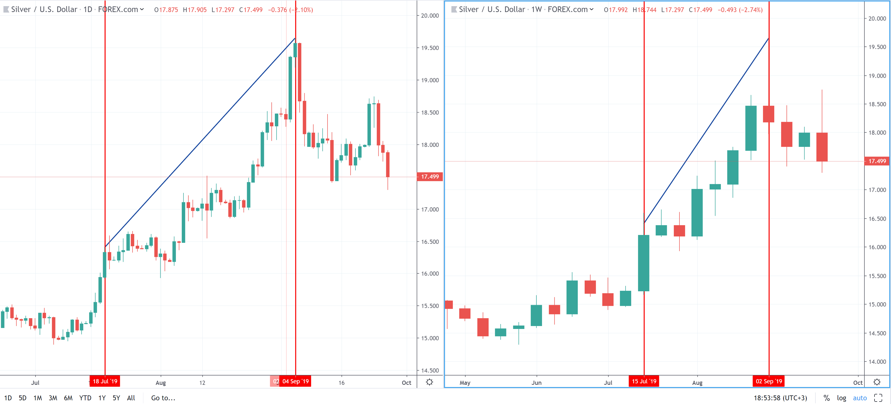
Timestamps that were selected as points on a daily chart are not the same as those displayed on a weekly chart. On a weekly chart, each timestamp marks the beginning of the week and the trend line points on a weekly chart will be displayed on marks that match the first days of the week (including daily chart days). This means that X coordinates of this line are different, while the trend line remains the same.
2. We are now going to draw the same (but factually a different) trend line on the weekly chart.
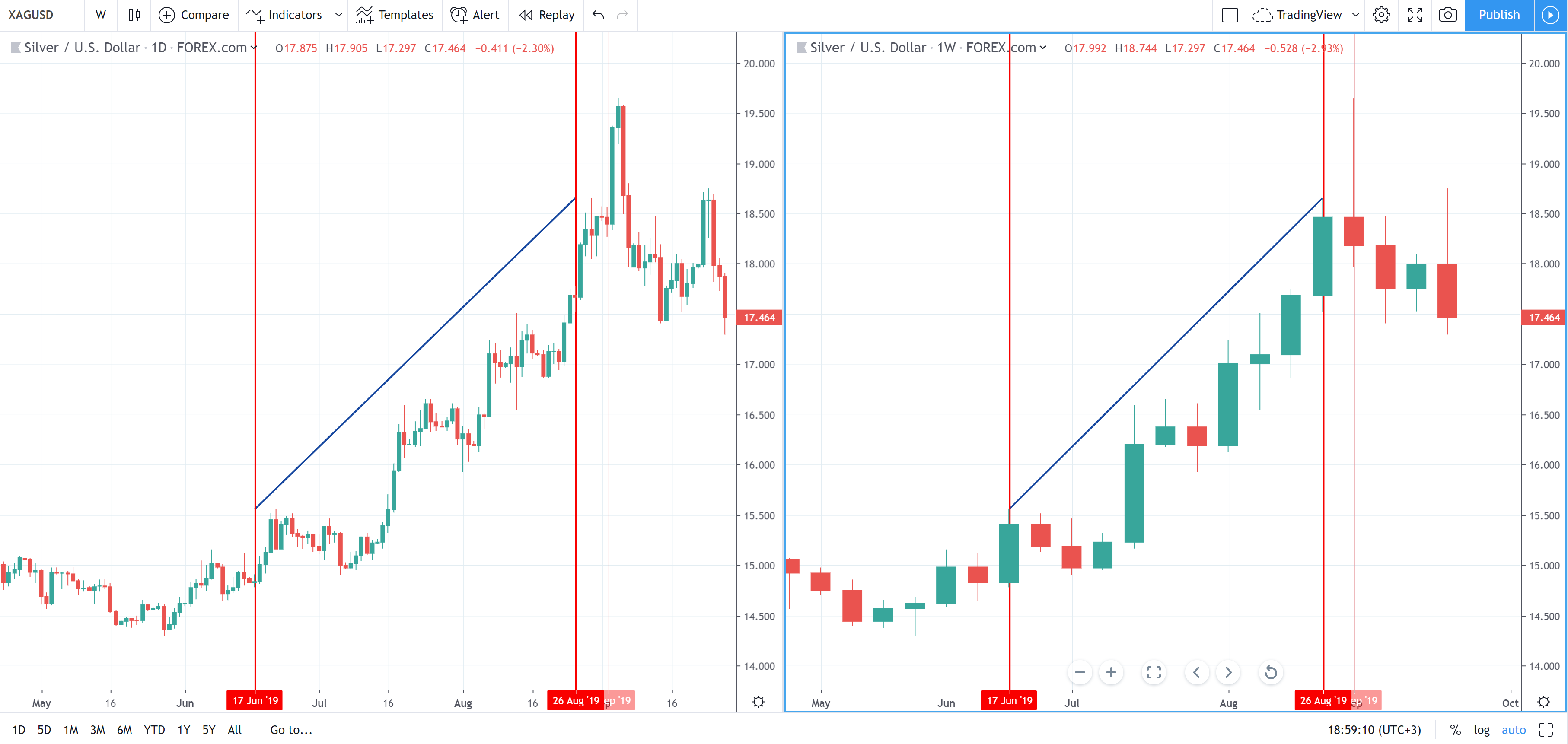
The timestamps that we used to place points on the weekly chart are available on the daily chart, so the trend line will be displayed exactly on those points. But on the daily chart trend line points will not touch the high price as they do on the weekly time frame since the line ends where the first day of the week starts (weekly high hasn't been reached yet).
It works the same when you draw something using a single chart layout and then switch the chart time frame. The drawing might be placed differently depending on the time frame that was used when it was originally added.