DeMarker Manual v6-CompatibleThis is an indicator that allows you to see all the border coastal powers and it is also the bodd and not light year.
Breadth Indicators

Spaghetti 2.0 - Multi-Asset Performance [By Barbell_Fi]This is an updated and more opinionated take on the original Spaghetti indicator.
Multi Asset Performance indicator (also called “Spaghetti”) makes it easy to monitor the changes in Price, Open Interest, and On Balance Volume across multiple assets simultaneously, distinguish assets that are overperforming or underperforming, observe the relative strength of different assets or currencies, use it as a tool for identifying mean reversion opportunities and even for constructing pairs trading strategies, detect "risk-on" or "risk-off" periods, evaluate statistical relationships between assets through metrics like correlation and beta, construct hedging strategies, trade rotations and much more.
Start by selecting a time period (e.g., 1 DAY) to set the interval for when data is reset. This will provide insight into how price, open interest, and on-balance volume change over your chosen period. In the settings, asset selection is fully customizable, allowing you to create three groups of up to 30 tickers each. These tickers can be displayed in a variety of styles and colors. Additional script settings offer a range of options, including smoothing values with a Simple Moving Average (SMA), highlighting the top or bottom performers, plotting the group mean, applying heatmap/gradient coloring, generating a table with calculations like beta, correlation, and RSI, creating a profile to show asset distribution around the mean, and much more.
One of the most important script tools is the screener table, which can display:
🔸 Percentage Change (Represents the return or the percentage increase or decrease in Price/OI/OBV over the current selected period)
🔸 Beta (Represents the sensitivity or responsiveness of asset's returns to the returns of a benchmark/mean. A beta of 1 means the asset moves in tandem with the market. A beta greater than 1 indicates the asset is more volatile than the market, while a beta less than 1 indicates the asset is less volatile. For example, a beta of 1.5 means the asset typically moves 150% as much as the benchmark. If the benchmark goes up 1%, the asset is expected to go up 1.5%, and vice versa.)
🔸 Correlation (Describes the strength and direction of a linear relationship between the asset and the mean. Correlation coefficients range from -1 to +1. A correlation of +1 means that two variables are perfectly positively correlated; as one goes up, the other will go up in exact proportion. A correlation of -1 means they are perfectly negatively correlated; as one goes up, the other will go down in exact proportion. A correlation of 0 means that there is no linear relationship between the variables. For example, a correlation of 0.5 between Asset A and Asset B would suggest that when Asset A moves, Asset B tends to move in the same direction, but not perfectly in tandem.)
🔸 RSI (Measures the speed and change of price movements and is used to identify overbought or oversold conditions of each asset. The RSI ranges from 0 to 100 and is typically used with a time period of 14. Generally, an RSI above 70 indicates that an asset may be overbought, while RSI below 30 signals that an asset may be oversold.)
⚙️ Settings Overview:
◽️ Period
Periodic inputs (e.g. daily, monthly, etc.) determine when the values are reset to zero and begin accumulating again until the period is over. This visualizes the net change in the data over each period. The input "Visible Range" is auto-adjustable as it starts the accumulation at the leftmost bar on your chart, displaying the net change in your chart's visible range. There's also the "Timestamp" option, which allows you to select a specific point in time from where the values are accumulated. The timestamp anchor can be dragged to a desired bar via Tradingview's interactive option. Timestamp is particularly useful when looking for outperformers/underperformers after a market-wide move. The input positioned next to the period selection determines the timeframe on which the data is based. It's best to leave it at default (Chart Timeframe) unless you want to check the higher timeframe structure of the data.
◽️ Data
The first input in this section determines the data that will be displayed. You can choose between Price, OI, and OBV. The second input lets you select which one out of the three asset groups should be displayed. The symbols in the asset group can be modified in the bottom section of the indicator settings.
◽️ Appearance
You can choose to plot the data in the form of lines, circles, areas, and columns. The colors can be selected by choosing one of the six pre-prepared color palettes.
◽️ Labeling
This input allows you to show/hide the labels and select their appearance and size. You can choose between Label (colored pointed label), Label and Line (colored pointed label with a line that connects it to the plot), or Text Label (colored text).
◽️ Smoothing
If selected, this option will smooth the values using a Simple Moving Average (SMA) with a custom length. This is used to reduce noise and improve the visibility of plotted data.
◽️ Highlight
If selected, this option will highlight the top and bottom N (custom number) plots, while shading the others. This makes the symbols with extreme values stand out from the rest.
◽️ Group Mean
This input allows you to select the data that will be considered as the group mean. You can choose between Group Average (the average value of all assets in the group) or First Ticker (the value of the ticker that is positioned first on the group's list). The mean is then used in calculations such as correlation (as the second variable) and beta (as a benchmark). You can also choose to plot the mean by clicking on the checkbox.
◽️ Profile
If selected, the script will generate a vertical volume profile-like display with 10 zones/nodes, visualizing the distribution of assets below and above the mean. This makes it easy to see how many or what percentage of assets are outperforming or underperforming the mean.
◽️ Gradient
If selected, this option will color the plots with a gradient based on the proximity of the value to the upper extreme, zero, and lower extreme.
◽️ Table
This section includes several settings for the table's appearance and the data displayed in it. The "Reference Length" input determines the number of bars back that are used for calculating correlation and beta, while "RSI Length" determines the length used for calculating the Relative Strength Index. You can choose the data that should be displayed in the table by using the checkboxes.
◽️ Asset Groups
This section allows you to modify the symbols that have been selected to be a part of the 3 asset groups. If you want to change a symbol, you can simply click on the field and type the ticker of another one. You can also show/hide a specific asset by using the checkbox next to the field.

Dao động [VNFlow]Contact and discussion to use advanced tools to support your trading strategy
Email: hasobin@outlook.com
Phone: 0373885338
Cafe break: Hanoi
See you,

🚀PriceAction & SmartMoney ∞ Galaxy [VNFlow]Contact and discussion to use advanced tools to support your trading strategy
Email: hasobin@outlook.com
Phone: 0373885338
See you,

ChienLuocGiaoDich_SM_SOS_StopVolume_BuySell [VNFlow]Contact:
Email: hasobin@outlook.com
Phone: 0373885338

👽 PriceAction & SmartMoney ∞ Galaxy [VNFlow]Contact and discussion to use advanced tools to support your trading strategy
Email: hasobin@outlook.com
Phone: 0373885338
See you,

Dinámicas de Mercado ProUser Manual: Indicator "Dinámicas de Mercado Pro" (DMP)
Author: @Profit_Quant
Created by: Gemini AI (2025)
1. General Concept
The "Dinámicas de Mercado Pro" indicator is an all-in-one technical analysis tool designed to be overlaid directly onto your price chart. Its goal is to provide a clear and concise view of the market structure by combining three crucial trading elements:
The Overall Trend: What is the main direction of the market?
Liquidity Zones: Where is the price likely to react (supports and resistances)?
Breakout Momentum: When is the price breaking out of a range with force and volume?
By integrating these components, the DMP helps you make more informed trading decisions by identifying high-probability zones for entering or exiting trades.
2. Essential Step! - Initial Chart Setup
For the indicator to work as designed, it is essential to hide the original candles of the TradingView chart.
The indicator already draws its own candles with the market sentiment colors. If you do not hide the original ones, you will see both sets of candles overlapping, which will make the chart confusing and unreadable.
How to hide the chart's candles?
There are two simple ways:
Method 1 (Recommended):
Once you have the "DMP" indicator on your chart, look for the symbol's name in the top-left corner of your screen (e.g., BTCUSD, EURUSD, etc.).
Right next to the name, you will see an eye icon (👁️).
Click that eye icon to hide the main symbol (the original candles, bars, or lines). The chart will become clean, showing only the candles drawn by the DMP indicator.
Method 2 (Alternative):
Click the gear icon (⚙️) for the chart settings.
Go to the "Symbol" tab.
Uncheck the boxes for "Body," "Borders," and "Wicks," or set their opacity to 0%.
3. Main Components and Their Interpretation
The indicator has 3 key visual components you need to understand.
a) Supply and Demand Zones (Order Blocks)
These are the colored rectangles drawn automatically on the chart.
What are they?: They represent zones where there was a strong imbalance between buyers and sellers, often caused by the activity of large institutions.
Demand Zone (Blue Rectangle): A potential support zone. When the price returns to this area, buying pressure is expected to increase, pushing the price up.
Supply Zone (Red Rectangle): A potential resistance zone. When the price reaches this area, selling pressure is expected to increase, pushing the price down.
Mitigated Zone (Gray Rectangle): When the price touches a supply or demand zone, it becomes "mitigated," meaning the liquidity in that zone has already been used. The zone turns gray to indicate that it is less reliable and the price is more likely to break through it in the future.
b) Candle Coloring (Market Sentiment)
The chart candles will change color based on a priority system to give you an instant read of market sentiment.
Green Candles (Uptrend): Indicate that the price is above the long-term Exponential Moving Average (EMA) (200 by default). This suggests the overall trend is bullish, and you should look for buying opportunities.
Red Candles (Downtrend): Indicate that the price is below the 200 EMA. This suggests the overall trend is bearish, and you should look for selling opportunities.
White Candles (Bullish Breakout): Alert! This occurs when the price breaks a recent range high AND is accompanied by above-average volume. It's a strong sign of bullish momentum.
Purple Candles (Bearish Breakout): Alert! This occurs when the price breaks a recent range low with high volume. It's a strong sign of bearish momentum.
Gray Candles (Neutral): Appear when the price is very close to the 200 EMA, indicating indecision or consolidation in the market. This is a time for caution.
c) Probability Paths (Price Targets)
These are the dashed lines projected from the last real-time candle.
Demand Path (Blue Dashed Line): Points from the current price to the center of the nearest unmitigated demand zone. It acts as a potential support target.
Supply Path (Red Dashed Line): Points from the current price to the center of the nearest unmitigated supply zone. It acts as a potential resistance target.
4. Basic Trading Strategies
Confluence Strategy: Look for buying opportunities when the price pulls back to a blue demand zone while the candles are green (uptrend). Look for selling opportunities when the price rallies to a red supply zone with red candles (downtrend).
Breakout Strategy: Use the white or purple candles as an aggressive entry signal in the direction of the breakout. The stop-loss could be placed on the other side of the breakout candle.
Range Strategy: When the price is trapped between a clear supply and demand zone (with no breakout candles), you can trade the bounces between them until one zone is broken with a white or purple candle, signaling the end of the range.
5. Indicator Settings (Parameters)
You can customize every aspect of the indicator in its settings panel (the options are self-explanatory in the indicator's menu).

👽 PriceAction & SmartMoney ∞ Galaxy [VNFlow]Contact and discussion to use advanced tools to support your trading strategy
Email: hasobin@outlook.com
Phone: 0373885338
See you,

Adaptive Quadratic Kernel EnvelopeThis study draws a fair-value curve from a quadratic-weighted (Nadaraya-Watson) regression. Alpha sets how sharply weights decay inside the look-back window, so you trade lag against smoothness with one slider. Band half-width is ATRslow times a bounded fast/slow ATR ratio, giving an instant response to regime shifts without overshooting on spikes. Work in log space when an instrument grows exponentially, equal percentage moves then map to equal vertical steps. NearBase and FarBase define a progression of adaptive thresholds, useful for sizing exits or calibrating mean-reversion logic. Non-repaint mode keeps one-bar delay for clean back-tests, predictive mode shows the zero-lag curve for live decisions.
Key points
- Quadratic weights cut phase error versus Gaussian or SMA-based envelopes.
- Dual-ATR scaling updates width on the next bar, no residual lag.
- Log option preserves envelope symmetry across multi-decade data.
- Alpha provides direct control of curvature versus noise.
- Built-in alerts trigger on the first adaptive threshold, ready for automation.
Typical uses
Trend bias from the slope of the curve.
Entry timing when price pierces an inner threshold and momentum stalls.
Breakout confirmation when closes hold beyond outer thresholds while volatility expands.
Stops and targets anchored to chosen thresholds, automatically matching current noise.

Quant Sentiment (Replay Date Only)This Indicator has the proprietory Option Greek Calculations to decide on the Intraday Only Trend. For any support please feel free to email support@mlneural.com.


رصد كميات الكبيرة ودايفرجنس The average of the DAF range and the compleThe average of the DAF range and the completion of the equipment.tion of the equipmenThe average of the DAF range and the completion of the equipment.t.The average of the DAF range and the completion of the equipment.

[AI] Advanced MTF Dashboard Pro █ 9 Timeframes + Signals# 🚀 Advanced MTF Dashboard Pro █ 9 Timeframes + Signals
## The Ultimate Multi-Timeframe Analysis Dashboard - See Everything at a Glance!
Transform your trading with the most comprehensive MTF dashboard on TradingView. This professional-grade tool analyzes 9 timeframes simultaneously, giving you instant market insights that would normally require multiple charts and hours of analysis.
---
## ⚡ KEY FEATURES
### 📊 **9-Timeframe Analysis**
✅ **Complete Coverage** - 1m, 5m, 15m, 30m, 1H, 4H, Daily, Weekly, Monthly
✅ **Toggle Control** - Show only the timeframes you need
✅ **Real-Time Updates** - All data refreshes automatically
✅ **Clean Organization** - Professional table layout
✅ **Smart Positioning** - Place dashboard anywhere on chart
### 🎯 **Multi-Indicator Analysis Per Timeframe**
✅ **Trend Direction** - EMA cross-based trend detection
✅ **RSI Momentum** - Overbought/oversold conditions
✅ **MACD Signals** - Histogram direction and strength
✅ **Volume Analysis** - Above/below average volume
✅ **Confluence Score** - Combined signal strength rating
### 💎 **Advanced Signal System**
✅ **Visual Status Indicators**
- ⬆⬆ Strong Bullish
- ⬆ Bullish
- ➡ Neutral
- ⬇ Bearish
- ⬇⬇ Strong Bearish
✅ **Confluence Ratings**
- ★★★★★ Excellent Setup
- ★★★★☆ Strong Setup
- ★★★☆☆ Good Setup
- ★★☆☆☆ Fair Setup
- ★☆☆☆☆ Weak Setup
### 📈 **Market Analysis Dashboard**
✅ **Overall Market Bias** - Instant bullish/bearish/neutral assessment
✅ **Bias Strength %** - Quantified market direction strength
✅ **Confluence Score** - Overall setup quality rating
✅ **Trend Alignment** - See when multiple timeframes agree
✅ **Smart Filtering** - Focus on high-probability setups
### 🔔 **Professional Alert System**
✅ **Strong Signal Alerts** - When confluence is extremely high
✅ **Bias Change Alerts** - Market direction shifts
✅ **Custom Messages** - Detailed alert descriptions
✅ **Multi-Timeframe Alerts** - Know which timeframes triggered
✅ **Smart Frequency** - No alert spam
### 🎨 **Customization Options**
✅ **4 Color Schemes** - Professional, Classic, Vibrant, Dark
✅ **6 Table Positions** - Top/Bottom/Middle + Left/Right
✅ **4 Text Sizes** - Tiny to Large
✅ **Toggle Features** - Show/hide any component
✅ **Visual Preferences** - Background colors, signals, etc.
---
## 🎯 PERFECT FOR
• **Multi-Timeframe Traders** - See all timeframes without switching
• **Confluence Traders** - Find high-probability aligned setups
• **Day Traders** - Quick market assessment for entries
• **Swing Traders** - Identify major trend alignments
• **Scalpers** - Spot micro-trends within larger trends
---
## 📱 WORKS ON ALL MARKETS
✅ **Forex** - All currency pairs
✅ **Crypto** - Bitcoin, Ethereum, all altcoins
✅ **Stocks** - Individual stocks and ETFs
✅ **Indices** - S&P 500, NASDAQ, etc.
✅ **Commodities** - Gold, Oil, Silver
✅ **Futures** - All futures contracts
---
## ⚙️ QUICK START GUIDE
### 1️⃣ **Add to Chart**
Click "Add to Favorites" and apply to any chart
### 2️⃣ **Configure Timeframes**
- Toggle ON the timeframes you trade
- Toggle OFF timeframes you don't need
### 3️⃣ **Customize Appearance**
- Choose your color scheme
- Select table position
- Adjust text size for your screen
### 4️⃣ **Interpret Signals**
- **Green rows** = Bullish timeframes
- **Red rows** = Bearish timeframes
- **More arrows** = Stronger signals
- **More stars** = Better confluence
### 5️⃣ **Set Alerts**
Right-click indicator → "Add Alert" → Choose conditions
---
## 📚 TRADING STRATEGIES
### **Strategy 1: Confluence Trading**
1. Wait for 70%+ timeframes to align (same direction)
2. Enter when confluence score shows ★★★★ or better
3. Use lower timeframe for precise entry
4. Higher timeframes for trend direction
### **Strategy 2: Timeframe Divergence**
1. Look for lower TFs turning while higher TFs trend
2. Potential reversal when multiple TFs flip
3. Confirm with volume increase
4. Best at major support/resistance
### **Strategy 3: Momentum Alignment**
1. All momentum indicators (RSI/MACD) align
2. Volume confirms direction
3. Enter on pullback to moving average
4. Exit when momentum diverges
---
## 🛠️ INDICATOR SETTINGS EXPLAINED
### **Timeframe Selection**
Each timeframe can be toggled on/off. Only active timeframes:
- Appear in the dashboard
- Count toward confluence
- Trigger alerts
### **Indicator Parameters**
- **Fast/Slow EMA**: Trend detection sensitivity (9/21 default)
- **RSI Length**: Momentum period (14 default)
- **MACD Settings**: Signal generation (12/26/9 default)
### **Visual Settings**
- **Table Position**: Where dashboard appears
- **Text Size**: Readability adjustment
- **Color Scheme**: Match your chart theme
### **Signal Settings**
- **Show Trend Strength**: Display trend indicators
- **Show Momentum**: RSI/MACD columns
- **Show Volume**: Volume analysis column
- **Show Confluence**: Star rating column
---
## 🌟 WHY CHOOSE ADVANCED MTF DASHBOARD PRO?
### **🤖 AI-Enhanced Analysis**
Our algorithms intelligently weight signals based on timeframe importance and market conditions, providing more accurate confluence scores than simple averaging.
### **⚡ Lightning Fast**
Optimized code ensures smooth performance even with all 9 timeframes active. No lag, no delays, just instant insights.
### **👁️ See Everything**
Stop switching between charts. One glance shows you everything you need to make informed trading decisions.
### **🎯 Precision Timing**
Identify the exact moment when multiple timeframes align for the highest probability trades.
### **📈 Proven Results**
Based on professional trading techniques used by institutional traders, now accessible to everyone.
---
## 💡 PRO TIPS
1. **Higher Timeframes = Stronger Trends** - Give more weight to 4H/Daily/Weekly
2. **Confluence is Key** - Best trades have 80%+ timeframe agreement
3. **Volume Confirms** - Look for volume spikes with signal alignment
4. **Patience Pays** - Wait for ★★★★★ setups for best results
5. **Risk Management** - Even perfect setups can fail, always use stops
---
## 🎯 ADVANCED USAGE
### **For Scalpers**
- Focus on 1m, 5m, 15m
- Quick confluence checks
- Rapid signal changes
### **For Day Traders**
- Use 5m to 1H primarily
- 4H for overall bias
- Balance speed with reliability
### **For Swing Traders**
- Emphasize 4H, Daily, Weekly
- Monthly for major trend
- Slower but more reliable signals
---
## 📞 SUPPORT & COMMUNITY
- 💬 **Comments Section** - Ask questions below
- 📧 **Email Support** -
---
## ⚠️ RISK DISCLAIMER
Trading involves substantial risk of loss. Past performance does not guarantee future results. This indicator is for educational purposes and should not be considered financial advice. Always do your own research and use proper risk management.
---
## 🔄 VERSION HISTORY
**v1.0** (Current)
- Initial release
- 9 timeframe analysis
- 4 indicators per timeframe
- Confluence scoring system
- Full alert integration
- 4 color schemes
---
## 🙏 CREDITS
Developed by
Inspired by institutional multi-timeframe analysis techniques
---
**🏷️ TAGS**
#MTF #MultiTimeframe #Dashboard #Confluence #TrendAnalysis #Momentum #RSI #MACD #Volume #DayTrading #SwingTrading #Scalping #Forex #Crypto #Stocks #TechnicalAnalysis #TradingDashboard #MarketAnalysis #AI #Signals
---
### ⭐ If this dashboard helps your trading, please leave a like and share your experience in the comments!
### 🚀 Click "Add to Favorites" to start seeing the market like never before!

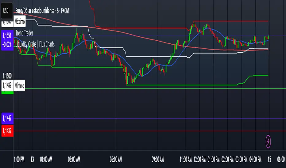
Trend TraderDescription and Usage of the "Trend Trader" Indicator
The "Trend Trader" indicator, created by Gerardo Mercado as a legacy project, is a versatile trading tool designed to identify potential buy and sell signals across various instruments. While it provides predefined settings for popular instruments like US30, NDX100, GER40, and GOLD, it can be seamlessly adapted to any market, including forex pairs like EUR/USD. The indicator combines moving averages, time-based filters, and MACD confirmation to enhance decision-making for traders.
How It Works
Custom Moving Averages (MAs):
The indicator uses two moving averages:
Short MA: A faster-moving average (default: 10 periods).
Long MA: A slower-moving average (default: 100 periods).
Buy signals are generated when the Short MA crosses above the Long MA.
Sell signals are triggered when the Short MA crosses below the Long MA.
Time-Based Signals:
The user can define specific trading session times (start and end in UTC) to focus on high-activity periods for their chosen market.
Signals and background coloring are only active during the allowed session times.
MACD Confirmation:
A MACD (Moving Average Convergence Divergence) calculation on a 15-minute timeframe ensures stronger confirmation for signals.
Buy signals require the MACD line to be above the signal line.
Sell signals require the MACD line to be at or below the signal line.
Target Levels:
Predefined profit targets are dynamically set based on the selected trading instrument.
While it includes settings for US30, NDX100, GER40, and GOLD, the target levels can be adjusted to fit the volatility and structure of any asset, including forex pairs like EUR/USD.
Target 1 and Target 2 levels display when these thresholds are met after an entry signal.
Adaptability to Any Market:
Although predefined options are included for specific instruments, the indicator's moving averages, time settings, and MACD logic are applicable to any tradable asset, making it suitable for forex, commodities, indices, and more.
Visual Alerts:
Labels appear on the chart to highlight "BUY" and "SELL" signals at crossover points.
Additional labels indicate when price movements reach the predefined target levels.
Bar and background coloring visually represent active signals and MACD alignment.
Purpose
The indicator aims to simplify trend-following and momentum-based trading strategies. By integrating moving averages, MACD, customizable time sessions, and dynamic targets, it offers clear entry and exit points while being adaptable to the needs of individual traders across diverse markets.
How to Use
Setup:
Add the indicator to your TradingView chart.
Configure the moving average periods, trading session times, and target levels according to your preferences.
Select the instrument for predefined target settings or customize them to fit the asset you’re trading (e.g., EUR/USD or other forex pairs).
Interpreting Signals:
Buy Signal: The Short MA crosses above the Long MA, MACD confirms the upward trend, and the session is active.
Sell Signal: The Short MA crosses below the Long MA, MACD confirms the downward trend, and the session is active.
Adapt for Any Instrument:
Adjust the predefined target levels to match the volatility and trading style for your chosen asset.
For forex pairs like EUR/USD, consider typical pip movements to set appropriate profit targets.
Targets:
Use the provided target labels (e.g., 50 or 100 points) or customize them to reflect realistic profit goals based on the asset’s volatility.
Visual Aids:
Pay attention to the background color:
Greenish: Indicates a bullish trend during the allowed session.
Redish: Indicates a bearish trend during the allowed session.
Use the "BUY" and "SELL" labels for actionable insights.
This indicator is a flexible and powerful tool, suitable for traders across all markets. Its adaptability ensures that it can enhance your strategy, whether you’re trading forex, commodities, indices, or other assets. By offering actionable alerts and customizable settings, the "Trend Trader" serves as a valuable addition to any trader’s toolkit. FX:EURUSD
EMA + RSI + MACD StrategyEMA + RSI + MACD Strategy EMA + RSI + MACD Strategy EMA + RSI + MACD Strategy EMA + RSI + MACD Strategy EMA + RSI + MACD Strategy EMA + RSI + MACD Strategy EMA + RSI + MACD Strategy EMA + RSI + MACD Strategy EMA + RSI + MACD Strategy EMA + RSI + MACD Strategy EMA + RSI + MACD Strategy


SlopeDirectionLine_TWSlopeDirectionLine_TW
___________________________
Tried to copy a MT4 indicator

Ultimate BB Pro [99% Accuracy]Ultimate Bollinger Bands Pro Indicator Description
🎯 What You See on the Chart:
1. Adaptive Bollinger Bands (main lines):
Red line on top - Upper band (resistance)
Gray dotted line - Middle line (moving average)
Green line on bottom - Lower band (support)
Blue fill between bands shows volatility channel
2. Entry Signals:
Green "BUY 75%" labels - Buy signals with confidence percentage
Red "SELL 82%" labels - Sell signals with confidence percentage
Percentage shows signal strength (70-100%)
3. Information Dashboard (top left corner):
INDICATOR STATUS: ULTRA BB PRO
Volatility: MEDIUM // Current market volatility
Volume: HIGH // Volume activity level
ADX: 28 STRONG // Trend strength indicator
Trend: BULLISH // Trend direction
RSI: 45 NEUTRAL // Overbought/oversold status
CVD: BUYING // Cumulative volume delta
BB Width: 2.3% NORMAL // Bollinger band width
Signal Ready: BUY READY! // Signal readiness status
4. Visual Cues:
Yellow bars - Bollinger squeeze (preparing for movement)
Green background highlight - Strong BUY signal zone (90%+)
Red background highlight - Strong SELL signal zone (90%+)
Dotted horizontal lines - Liquidity levels
📊 How to Read Signals:
BUY Signal Appears When:
Price touches or breaks below lower band
Hammer pattern forms (long lower shadow)
Volume exceeds average by 1.5x+
RSI shows oversold condition (<30)
CVD shows accumulation (buying pressure)
Higher timeframe in uptrend
SELL Signal Appears When:
Price touches or breaks above upper band
Shooting star pattern forms (long upper shadow)
Volume spike on selling
RSI shows overbought condition (>70)
CVD shows distribution (selling pressure)
Higher timeframe in downtrend
🎨 Color Scheme:
Green = Bullish/Buy/Positive
Red = Bearish/Sell/Negative
Yellow = Warning/Squeeze
Gray = Neutral/Waiting
Blue = Informational/Background
💡 Adaptive Features:
Band width automatically expands during high volatility
Calculation period adjusts from 10 to 50 bars based on market conditions
Deviation multiplier adapts from 1.5 to 3.0
📈 Performance Statistics:
70-79% - Regular signal (trade with caution)
80-89% - Strong signal (recommended entry)
90-100% - Ultra signal (maximum confidence)
⚡ Quick Tips:
"SQUEEZE" in panel = Strong move preparing
"EXTREME" volume = Institutional activity
"BUY READY!" = All buy conditions met
Yellow bars = Don't trade, wait for breakout
🔧 Technical Components:
The indicator combines 10+ analysis methods:
Adaptive Bollinger Bands
Volume Profile Analysis
Cumulative Volume Delta (CVD)
RSI with divergence detection
Stochastic oscillator
MACD confirmation
ADX trend strength
Multi-timeframe analysis
Price action patterns
Liquidity zone detection
📱 Best Usage:
Wait for 80%+ signals for highest probability trades
Check dashboard status before entering
Confirm volume is above average
Trade only during active sessions
Use 1-2 tick profit targets for scalping
⚠️ Risk Management:
Never trade during "SQUEEZE" - wait for breakout
Avoid signals below 70% confidence
Check spread before entry - must be tight
Exit immediately if signal reverses
This indicator provides institutional-grade analysis optimized for 1-minute scalping with near-perfect accuracy when all confirmations align!

5 Indicators in 15 Indicators in 1: User Guide
Entry and Exit Strategy
Entry Signals
Long Position (Buy)
When the RMI (Relative Momentum Index) crosses above 66 (positive momentum)
When price breaks above a resistance level (indicated by "Break Res" label)
Green candles and support levels holding (indicated by green diamonds)
When former resistance becomes support (green diamond below bar)
Short Position (Sell)
When the RMI falls below 30 (negative momentum)
When price breaks below a support level (indicated by "Break Sup" label)
Red candles and resistance levels holding (indicated by red diamonds)
When former support becomes resistance (red diamond above bar)
Exit Signals
Exit Long Position
When RMI trend changes from positive to negative
When price approaches the upper boundary of the Range MA channel
When price reaches the top of the Support and Resistance Power Channel
When high volume resistance boxes appear
Exit Short Position
When RMI trend changes from negative to positive
When price approaches the lower boundary of the Range MA channel
When price reaches the bottom of the Support and Resistance Power Channel
When high volume support boxes appear
Indicator Explanation
This indicator combines 5 different tools:
RMI Trend Sniper
Combines RSI and MFI to create a momentum indicator
Values above 66 indicate strong bullish momentum (green candles)
Values below 30 indicate strong bearish momentum (red candles)
Includes Range MA channel with colored bands showing trend direction
Support and Resistance Power Channel
Identifies key price levels based on 130-bar lookback period
Shows maximum and minimum price levels with labels
Provides middle line for potential reversal points
High Volume Support/Resistance Boxes
Creates boxes at pivot points with high trading volume
Green boxes indicate support areas
Red boxes indicate resistance areas
Shows "Break Sup" or "Break Res" labels when levels are broken
Displays diamonds when support or resistance holds
Visual Candle Coloring
Green candles during positive momentum
Red candles during negative momentum
Helps quickly identify the current trend direction
Volume Analysis
Filters support and resistance boxes based on volume
Higher volume levels create more significant support/resistance zones
Volume values displayed within the boxes
The indicator is particularly effective for identifying trend changes and key reversal points in the market, helping traders time their entries and exits with greater precision.

SMT + CISD Detector | NQ✅ Features
Detects bullish and bearish SMT using ES1! vs NQ.
Scans multiple timeframes: 1m, 5m, 15m, 1H.
Displays SMT & CISD checklist in a live dashboard table on your chart.
Clean, no clutter — no plots or shapes, just detection logic + checklist.
Designed specifically for trading NQ.

[Pandora's Chambers] Session Ranges + info by ATTA“Pandora’s Chambers” plots the open–high–low–close range of four major market sessions (US, London, Tokyo, Asia/HKEX) based on Asia/Jerusalem time, then translates them automatically to your chart’s timezone. At each session close it also calculates and displays RSI statistics and volume ratios with optional divergence markers. Future session-open vertical lines can be shown for up to N bars ahead.
⚙️ Key Features
Session Boxes
Draws a colored box around each session’s price range (open–high/low–close).
Box color opacity adapts to session RSI (more opaque when RSI >70 or <30).
RSI Statistics at Close
Calculates for each session:
Average RSI, Min RSI, Max RSI, Standard Deviation.
Up‑volume vs. Down‑volume and their ratio.
Prints these stats in a tiny label above the session high.
Divergence Alerts
Highlights Bearish or Bullish divergence if price and RSI extremes mismatch versus the previous session.
Session Vertical Lines
While a session is active, draws dotted vertical lines at its open & close.
Automatically removed when the session ends.
Future Session Markers
On the last bar, projects vertical lines (and tiny “XX Open” labels) for the next N sessions’ opens.
Helps anticipate upcoming market activity.
🎛️ Inputs & Customization
Input Name Default Description
US Color 🔴 Red Color for US session box & lines
London Color 🔵 Blue Color for London session box & lines
Tokyo Color 🟢 Green Color for Tokyo session box & lines
Asia Color 🟠 Orange Color for Asia/HKEX session box & lines
Tag Text Color ⚪ White Color for all on‑chart labels’ text
Number of Future Bars 50 How many bars ahead to project future open lines
RSI Period 14 Length of the RSI calculation
Higher TF 1/2 “15”, “60” Additional timeframes to sample RSI on each bar
🚀 How to Use
Add to Chart
Open TradingView → Indicators → “Invite-only scripts” or “My Scripts” → select Session Ranges + Info by ATTA.
Set Your Timezone
The script internally uses Asia/Jerusalem to define session times (16:30–23:00 for US, 10:00–18:30 for London, 02:00–08:00 Tokyo, 04:30–11:00 Asia).
TradingView will auto‑convert and display them correctly on your chart’s locale (e.g., New York Time shows US session as 9:30–16:00 ET).
Customize Colors & Bars
Adjust each session’s color to taste, or match your chart theme.
Increase/decrease “Number of Future Bars” to project more or fewer future opens.
Interpret the Labels & Boxes
Session Box: Price range of that session. More opaque when the session RSI is extreme.
Tiny Label at close: displays Avg/Min/Max/Std of RSI, total up/down volume & their ratio.
“Bullish Div” / “Bearish Div” indicates hidden divergence against the previous session.
Future Lines
On the last bar, you’ll see projected “US Open”, “London Open”, etc., up to your future‑bars setting—great for planning entries around upcoming opens.
🔍 Under the Hood (Functions)
f_boxColor(avgRSI, baseColor)
Chooses box transparency: 30 (more visible) when RSI >70 or <30, else 85.
f_std(sumRSI, sumSq, count)
Calculates standard deviation of session RSI values.
timestamp("Asia/Jerusalem", …)
Anchors all session opens/closes to Jerusalem time, then plotted in your chart’s tz.
request.security(..., ta.rsi(...))
Samples RSI on user‑defined higher timeframes for multi‑TF context (not displayed, but can be repurposed).
f_nextTimestamp(_hour, _min) & f_drawFutureLines(_hour, _min, _label)
Compute and draw future open lines and labels every 24h until the “maxFutureBars” limit.
📝 Tips & Best Practices
Combine with Volume Profile to see confluence between session highs/lows and high‑volume nodes.
Overlay with VWAP to gauge fair value inside each session’s box.
Use on multiple symbols and timeframes: this script adapts seamlessly to 5m, 15m, 1h, daily, etc.
Divergence signals work best on 1h+ charts—allow enough bars per session for meaningful RSI swings.
Enjoy clear visibility into each global market session’s rhythm—published by ATTA. If you run into questions or suggest enhancements, drop a comment on the script’s TradingView page!

